
Artist and designer Dominic Wilcox gave an inspiring keynote to close out this year’s conference in Amsterdam. He focused on how to generate ideas and make them a reality, beginning with a quote by Leonard Cohen: “If I knew where songs came from I’d go there more often.”
He stressed the importance of playfulness and many of his examples shared a zany, improvisational style. For him ridiculousness was a virtue. The crowd enjoyed this and I heard more laughter and spontaneous applause during his keynote than I’d heard throughout the rest of the conference combined.
His Lost and Found Office of Oddities reminded me of the infamous Gary Larson cartoon “Cow Tools” from The Far Side. Dominic assembled random objects into hypothetical products and left enough ambiguity for people to interpret them in interesting ways. For example: diving flippers mounted on roller skates.
By far his best received project was a series of 19 workshops held with children around the UK to generate interesting ideas. Dominic wanted to show children the power of creativity. He opened a storefront to exhibit their sketches along with 23 physical prototypes by local makers showing the potential for the concepts. He’s now developing the workshops into a worldwide initiative called littleinventors.org. The audience at SDGC16 liked this quite a bit and some even gave a standing ovation.
Ostensibly this presentation wasn’t focused on service design but there were some nice takeaways about how to generate ideas including embracing the ridiculous, biasing for action and avoiding analysis and procrastination. I think that’s something every designer can integrate into their practice and it was a nice way to end the conference on a high note.
Geert Christiaansen shared an overview of 90 years of design evolution at Philips. He focused on the role design plays in innovation and strategy at the company. It seemed a little awkward coming directly after Romy van den Broeke’s unflattering characterization of Philips in her presentation and honestly most of his examples seemed better suited to a product design conference than a service design conference.
At the very end of the talk, Geert shared a brief video of a design collaboration between Philips and Florida Medical Center which was a much better fit for the service design context. It showed how Philips worked with nurses and doctors at a system level doing noise and alarm analysis and spatial flows of movement throughout the hospital. They even strapped themselves to gurneys for a first-hand glimpse of the patient experience.
It was a slick video and an admirable design effort but it seemed completely disconnected from the first 15 minutes of the talk which until then had been essentially a commercial for Philips (or maybe a hiring pitch). That’s not unprecedented; I think Doberman took the same approach last year in New York but they were filling a last minute gap in the conference schedule and they had the saving grace to actually be a service design firm.
Geert conceded that they’re a work in progress; their methodologies are constantly changing. If Philips participates in future service design conferences I’d like to see them focus less on history and more on their collaborative approach to service design.
Romy van den Broek from Berge spoke about service design pioneering in the hardware industry and how large organizations are making the transition from being hardware producers to software and services providers. Her framing was one of friction, culture clashes, transition and language. She shared four brief case studies along with lessons learned:
Philips Design Probes was focused on far future design research; the world of tomorrow. But what she learned was that an unanchored vision is no vision at all. Their work failed to align with the rest of the company which was transitioning from being a market leader to a market follower.
Ericsson Innova Squad built on design thinking implementation with a small team of one designer and two “enthusiasts.” She learned that it was important to be a Trojan Horse (a metaphor that Jess McMullin used yesterday). Engineers might not be familiar with design terminology or tools. It’s important to learn the culture of your audience; adjust the way you present. For example, she made a customer journey map in PowerPoint rather than Illustrator so that her entire team could have ownership; she needed to use their tools.
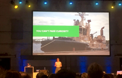
Caterpillar Propulsion was a field study of tug and ferry boat levers. She interviewed the crew onboard. I liked her articulation that you can’t fake curiosity. If you’re not curious about other people’s experience, you really have no business being a service designer. Start asking questions; show curiosity. Like the Ericsson example she tried to fit in; to be one of the guys. Not everyone is immediately enthusiastic so it’s important to build relationships.
Volvo Construction Equipment focused on service design in software development. This was more like interaction design. Fleet management systems. Her learning here was to understand hierarchies and make use of them. The culture at Volvo was very hierarchical and very territorial. Understand agendas; politics. Make friends in different departments and find allies with similar goals. It’s also to stick around; change does not happen overnight.
Romy summed up her experience by noting that the power of service design lies in its many faces. She conceded that service design in a hardware or manufacturing context is not flashy; it’s humble and hard work. Like other service designers she articulated that the designer should not be the star; everything should be about the result.
I was skeptical going into Merijn Neeleman’s presentation on 3D printing. There might be a way to make an argument for 3D printing at a service design conference but this wasn’t it. Merijn began with a history of the development of 3D printing; more than doubling in adoption every year. He framed its virtues as flexible, fast and decentralized. He shared examples of how it can be used in the product design process. In my view the talk would have been better received at a first- or second order design conference; I’m really curious about how it ended up here in Amsterdam.
From a product design perspective the main takeaway was his taxonomy of 3D printing at various stages of the product design lifecycle. Traditional prototyping occurs throughout a project as a means of learning, but he also recognized its use early in the development of a new idea as a tool for provocation. He called this “provotyping.”
Again, not a bad talk necessarily; just strikingly out of place coming on the heels of several dozen platonic examples of service design over the past two days.

Paula Bello from Live|work spoke about her experience as the first service design manager at KONE, a company founded in the 1800s around the manufacture of elevators, escalators and automatic doors. The name KONE translates to “machine” in Finnish but like other companies such as Rolls Royce they have reframed their offering in service terms; today KONE is in the business of “people flow,” moving over a billion people per day.
Paula took us through the evolution of service design at KONE as a series of reactions from key stakeholders as they built an internal competence:
- What is service design?
- What does it mean for KONE?
- Why do we need to do it like this?
- Oh, so this is what it does!
She convinced leadership to allocate money for a small pilot. Something to demonstrate value and show a quick win. Once people got a taste for service design the conversation changed:
- Could we use this approach?
- Do we need so many people involved?
- How to make sense of all this”subjective” data?
- Really? Is this what customers think?
People who had worked there for 40 years thought they knew their customers. This process helped to challenge those assumptions. But as their methods began to uncover new problems it led to questions:
- How could we respond to so many needs?
- But… this is beyond design!
- How to implement this?
Paula wrapped up her presentation by summarizing three lessons from her experience at KONE.
- The first customer is the organization itself.
- Concrete, tangible outcomes are important.
- Transform the business from within.
Many of the presenters this year have spoken about the drawbacks of hiring external consultancies and I think that this presentation highlights a new facet. Paula was the service design manager at KONE; she hired Live|work to help with a project; now she works directly for them. I’ve seen that type of hiring happen in both directions but it seems less than ideal for companies that are focused on building an internal competence.
Judy Mellett from TELUS and Chris Ferguson from Bridgeable spoke about how internal teams and external consultants are transforming partnership and practice. Judy is the director of service design innovation and strategy at TELUS. Chris is the second designer from Bridgeable to present at the conference this year (after Linn Vizard from yesterday).
Judy and Chris shared a case study from TELUS about improving the worst-ranked service experience at the telecom: renewing a cellphone contract. Bridgeable collaborated with the internal design team at TELUS. Their service design effort improved their net promoter score and realized cost savings of $70 per customer.
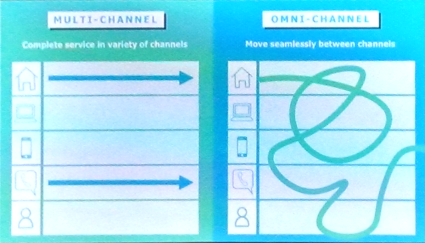
One interesting point was the distinction between multi-channel services and omni-channel services where customers move seamlessly between channels.
Another common theme that I saw reflected in other presentations concerned the second order benefits of the service design process for the organization; beyond the solving of a discrete service design problem.
I also liked their formulation of service design as a political act. TELUS employs over 30,000 people and for this project they brought together stakeholders from 15 different parts of the organization. Many of these people had never met and few had ever heard of service design. The process facilitated opportunities for collaboration among these people; just by being in the same room.
Early on they focused on quick wins. They built operational alignment and shared metrics so that projects worked toward common goals rather than negatively impacting other departments. Key outcomes involved connecting stakeholders, improved collaboration and better engagement.
Judy and Chris acknowledged some of the same problems with agencies that others have recognized during the conference. External teams make it hard to maintain momentum once a project is handed off. Building an internal capacity helps to ensure that the design intent is respected during implementation. The internal team can shepherd the cause and aggregate value over time.
The ultimate goal for any service design integration is to deliver excellent impact for both customers and the business.
Paul Mutsaers and Anna-Louisa Peeters shared seven learnings from their efforts to make Rabobank a more customer centric organization.
They kicked off their presentation with a metaphor that many people in the audience recognized; a tugboat towing a huge tanker. Their task was to get Rabobank moving in the right direction. To do that they focused on building their own internal service design capacity rather than simply acquiring one as in the case of Capital One. They ultimately built a team of roughly two dozen designers.
A common theme across many presenters today has been to deny that their experience is universal to the wider audience or that they have the exclusive word on how best to do service design. Paul and Anna-Louisa stressed that they don’t have a magic recipe; there’s no manual for how to make service design work in house. It’s just a lot of challenging hard work.
Their seven key points:
- Pair a service design with a customer journey manager. Many people within the organization think they already know what customers need. Countering those objections is a major obstacle and depends on having some organizational credibility on the team. Service design processes need explaining and stakeholder management is key to success.
- Make sure service design is at the core of your business. They moved from being aligned with IT in more of a tactical role to creating their own customer experience group focused on influence at the strategic level. That gave them bargaining power by putting them in touch with key stakeholders at the requirements gathering phase rather than simply executing on pre-existing plans.
- Connect with existing ways of working. In the past agencies had done service design for them. They needed to do it on their own to maintain consistency and build ownership of the results. This helped with acceptance of ideas and alignment with others. They developed an extensive internal guidebook PDF. Essentially a step-by-step guide for service design at Rabobank. Tips, tricks and tools to run a successful service design projects within the organization
- Set up a balanced team. Who you include on the team is important. Different perspectives; the right energy; future buy-in. Different perspectives make it more fun and more effective. Including stakeholders who can build a sense of ownership over the process helps to build support going forward.
- Show your work. Being visible within the organization is important. Many of the artifacts are tools for evangelization. Demonstrate worth; visualizing what we do. Get a stronger position within the organization. It helps to brand their contribution.
- Be the customer’s advocate. Set up a qualitative research lab in Utrecht. Validate assumptions; discover new opportunities; stay on the right track. Demand budget for research at the beginning of the project. Stress the risks of skipping it.
- Stay inspired. It can be challenging to stay current with design trends. Stay inspired by going to conferences, reading books and blogs.
For each point they emphasized both a “why” and a “how,” something I appreciated since many presenters focused heavily on either the tactical or strategic elements of their approach but rarely on both.
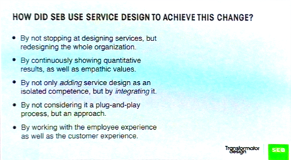
Josefin Eklund from SEB and Daniel Ewerman from Transformator shared insights from their collaboration to make SEB a more customer-centric organization. They presented a case study into the redesign of the pension planning process.
SEB is a 160 years old banking in Sweden; three years ago they started from scratch to build a service design capability in partnership with Transformator. Like many presenters they stressed that what worked for them might not work for everyone. Service design isn’t a plug-in process; it’s an approach.
The initial collaboration with Transformator was focused on a particular project; something that had good visibility within the organization. But designing the service alone would have a limited effect; they recognized that they needed to change the organization itself. The service design project was the raw material needed to begin that transformation and engage people within the organization.
The team focused on basic proofs of concept that could be scaled up. They constantly needed to show results and demonstrate value. Internal stakeholders stressed KPI metrics.
Service design helped SEB to connect at the strategic, tactical and operative level. Touchpoints are primarily tactical but the governing insights and guiding principles helped them to have influence at the strategic level.
Focusing on the customer experience wouldn’t have been enough in itself. The team needed to create new behaviors for the staff. Most people thought they already knew what customers wanted; after all, they had been working with customers for decades. The service design approach helped to challenge some of those assumptions.
The design team wrote a book for service design evangelization within the organization. They joked that “there’s no religion without a book” and SEB needed to make the methods their own.
Ultimately the project didn’t just change ways of working; it changed ways of thinking within the team. Employees started communicating their projects from an end-user perspective and it strengthened the organization’s ability to function in a customer-centric way. This involved knowledge, mindset, tools, experience, processes and change coaching.
SEB has going from 7th to 4th in the pension market over the past three years. Their goal is to be number one by 2020. As Josefin and Daniel mentioned at the beginning of their presentation they stressed that there is no one process that works for everyone. The value comes from tailoring the process to the needs of a particular organization.
Martin Dowson from Lloyds Banking Group in the UK spoke about building an “Internal Design Academy” to train more than 200 people in service design practices within his organization at LBG. He shared his experience across many large organizations, working from both the outside as a consultant and from the inside as in his current role.
The focus for this morning’s group of presentations concerns how to build internal design capabilities. Transforming the customer experience first requires transforming the organization. Martin stressed that senior executives need to really understand the importance of this transformation. Getting that buy-in has been a common theme across several presentations.
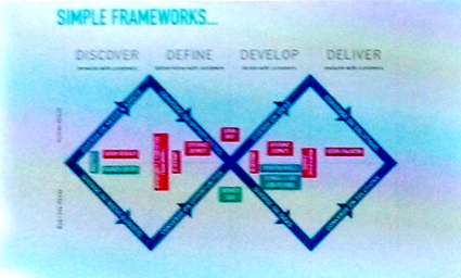
Much of the presentation focused on the versatility of the double diamond framework for approaching design problems. Discover, Define, Develop, Deliver. He valued it as a lens for understanding methods and evangelized that design is a problem solving activity that can be applied to almost anything. The principles and approach apply to many types of problems.
He organized his presentation around a key strategic goal and four supporting tactical approaches. Primarily, good business is human centered, design-led and sustainably delivered. Building what he called a guerrilla design movement requires immersion, ongoing support, celebration of internal achievements and challenging groups to evolve and grow.
He framed immersion as distinct from training. To understand the power of these techniques you really need to experience them first-hand. Based on the widespread Service Design Jam structure he set up two-day sessions with 20 people to implement the double diamond and expose them to a design process. This gives team members a safe space to practice these techniques.
He also stressed that ongoing support is critical. You can’t just give people these techniques and send them off into the wild. Build confidence incrementally and make it clear that small wins are okay.
That leads into the importance of recognizing achievement for teams that are new to service design methods and uncertain about the outcomes and since not everyone will get the chance to put this into practice right away, creating opportunities for people to practice their design and research skills.
Ultimately he called for a reframing of the traditional relationship between client and agency. Is it possible to co-design the experience of designing? Can agencies help clients learn along the way? Less of doing the design for clients and more about how teaching clients how to design.
The closing keynote this afternoon by Cees van Dok focused on the observation that as challenging as software design can be, adding hardware makes it even harder. He provided examples from his tenure as Head of Design at TomTom.
Martijn van der Heijden has a nice visualization sketch of the keynote; Hazel White posted another good sketch that captures the talk. Both have been really great today about posting their output from the conference.
Cees spoke about the obstacles to the creation of successful services along with an honest appraisal of the failure of the TomTom Taxi from 2012 in the wake of Uber. He spoke about tangible artifacts and multi-device continuity represented by services such as Netflix and how TomTom re-framed its mandate in the wake of smartphones which began dominating the GPS landscape nearly a decade ago. Their broader goal these days is essentially to make cities smarter.
He spoke about the TomTom VIO for scooters which resonated with my chosen mode of transportation in San Francisco. It’s an example of how tangible artifacts act as the avatar of a service and help to create better experiences.
His keynote wrapped up a great first day for the Service Design Global Conference in Amsterdam.
